
 Remotion
 HyperFrames
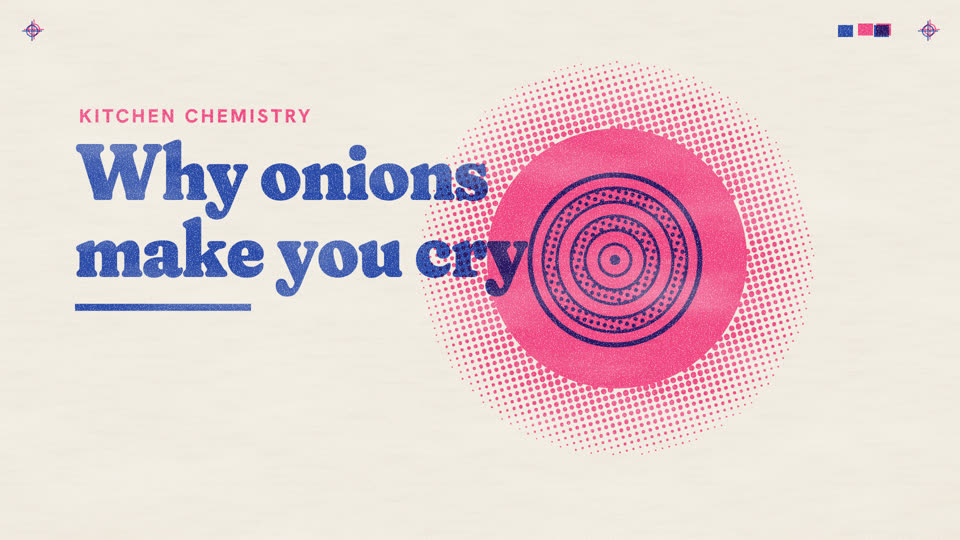
A two-ink duplicator print: flat blue and pink shapes on warm paper, halftone dots for tone, violet where one ink lands on the other. The film is the print being made: plates roll on in turn, and on the accent they knock apart and snap back.
Essence, and what it is not
- One sheet of warm paper, registration targets in its top corners, a colour bar of the inks. Everything is printed on it.
- Two inks only: blue, the key plate, carries silhouettes and words; pink is the second. They multiply, so pink over blue prints violet, a colour neither plate holds: the motion's reveal.
- Tone is never a gradient: halftone dots on the plate's own angle, in stepped tints, swelling where tone grows.
- The plates sit a few pixels out of register; ink is uneven, with pinholes and paler streaks along the feed.
Not a halftone dossier or newsprint (no columns, photographs, case files or black), not flat vector (no clean fills, outlines or gradients), not Iso Works (no depth), not Red Pencil (nothing is marked up).
Ground and material
paper.tsx is the sheet and, as the top part (layer="grain", z 9), the ink's pinholes and mottling, laid with lighten so bare paper is untouched. Every component prints through riso.ts: a Plate per ink, mix-blend-mode: multiply onto the sheet and the other plate; screens are <pattern>s fixed to the sheet at 15° (blue) and 75° (pink), 14 px apart; dotsPath screens a tone that varies over the sheet. Words are SVG text on a plate; a knocked-out word is a hole in the ink (a mask), never white paint.
Colour roles
datablue: the key plate. Every shape that must read alone and every word, except a kicker or a tag.gradpink: the second plate. What the sentence stresses, the second of two things, a sun, a glow, a gas.opviolet: never painted. It appears where pink prints over blue; the token names it for words that must quote it.bgpaper: highlights and knockouts are simply no ink.- Tints are 15, 30, 50 or 70 per cent of one ink (
tint()); at most one tint in any area, over at most one solid. good,bad,warnare the two inks again: no green, red or yellow on this press.
Type and captions
Fraunces 900, soft corners ("SOFT" 100), for titles and what two things make: 120 to 170 px, tight. Hanken Grotesk 700 to 800 for labels (40 to 46 px) and kickers (capitals, tracked 0.12 to 0.14 em, in pink); tags knock their words out of solid ink at 40 px. JetBrains Mono for code. Chinese: Noto Sans SC at 900 for titles, 700 for labels. The caption is a strip of bare paper with blue text at 36 px, weight 600, and a pink rule at its left: a label printed in the margin of the sheet.
Motion
Prints do not fade. A plate arrives by the roller (blue or pink, 0 to 1 linearly over 0.6 to 0.9 s), a band of fresh ink at its edge; blue first, pink after, so violet appears on the second pass. A tag is stamped (0.45 s: its leader drawn, then the block dropped from a little larger). A tone grows by its dots swelling in place (1.5 s or the line's length, easeInOutSine). The knock (slip 0 to 1 linearly over 1.4 s, on the accent word): the plates jump 24 px apart, hold with a dying wobble, and snap back in one frame. Letters hit over 1.6 to 1.8 s; a flood fills in 0.8 to 1 s (easeInQuad) and ebbs in 1.1 s (easeOutQuart); a push into the dots runs about 1.4 s (easeInQuad) to a cut.
Composition and framing
A poster's layout: one large printed thing, words beside or over it, bare paper around. Let pink overlap blue on purpose: a sun over a title's end, an iris over the lid. The subject takes a third of the frame or more; labels are 40 px or larger. Nothing below y 870. One knock per scene, on the scene's accent, and at most one in a background part.
Sound
Optional: a drum thump as a plate rolls on, a paper slap for a tag. No whooshes.
Components
- compare — Overprint (
react/parts/overlap.tsx): Two things, one in each ink, kept apart by a wall in a frame; the wall breaks, they slide together, and violet appears where they overlap, with the name of what they make. Fits: two ingredients that react; two groups and what they share - data — Halftone plume (
react/parts/tone.tsx): Something that spreads, in halftone dots only: a plume runs out along a curve, its dots swelling thick at the heart and thinning to paper, its lumps drifting. Fits: a gas or heat rising; a population spreading; a rumour fanning out - ground — Sheet (
react/parts/paper.tsx): Warm duplicator paper with tooth and fibres, registration targets and a colour bar; a second layer over everything shows paper through the ink as pinholes and mottling. Fits: every scene: the ground under all parts, and the grain over them (layer="grain") - mark — Tag (
react/parts/tag.tsx): A notched block of one ink with its words knocked out to paper, on a leader to what it names; stamped down, never faded in. Fits: naming a part as it is said; a feature of a product; a short verdict - term — Stencil (
react/parts/stencil.tsx): The subject as flat shapes on the blue or pink plate, solid or in a stepped tint; pink over blue prints violet. No outlines: a form is its silhouette. Fits: the thing a film is about (a product, an organ, a fruit) drawn as a print - title — Poster title (
react/parts/title.tsx): A big soft heavy title on the blue plate whose letters hit one by one, with a pink sun in a halo of dots printed over its end so those letters turn violet. Fits: the question a film opens on; a chapter title; the line it ends on - transition — Ink flood (
react/parts/flood.tsx): One ink floods the sheet from a shape, a fringe of dots ahead of its edge, until everything beneath is overprinted; next scene it ebbs into that scene's first shape. Fits: a reaction spreading; a close-up opening into a whole; one shape becoming the next
Native moves
- The second ink. Pink prints over blue; violet appears where they overlap. Fits content like: two chemicals reacting; a product meeting its user.
- Tone by dots. A tone spreads as its dots swell, and its lumps keep drifting (
rise). Fits content like: a gas; a population growing. - The knock. On the accent the plates jump apart, hold, snap back. Fits content like: a sting; a market shock; a punchline.
- Letters hit. Each letter's pink flies in off register onto its blue and snaps home (
type). Fits content like: a title; a verdict. - Flood the sheet. One ink floods out of a shape over the frame, then ebbs into the next scene's first shape (
Flood). Fits content like: a reaction spreading; a part becoming the whole. - Into the dots. A camera pushes into a halftone until each dot is a disc, then cuts (
Toneview). Fits content like: entering a gas, a crowd, a cell. - Roll on, stamp. Blue is laid first, pink after; a tag is stamped on what it names. Fits content like: a product drawn, then coloured; a feature.
Avoid: pitfalls
- Three halftones in one area are mud. Fix: one tint per area, over at most one solid.
- Pink alone fades on paper. Fix: blue carries what must read; pink overlaps and stresses.
- A knock everywhere is noise. Fix: one per scene, on its accent.
- A fade in or out reads as video, not print. Fix: roll a plate on, stamp a tag, cut away.
- A white fill paints, it does not knock out. Fix: evenodd holes, masks.
- A smooth gradient on ink is not this press. Fix:
tint()ordotsPath. - A straight cone of dots reads as a spotlight. Fix:
Tonesways and lumps it.
Freedom in each work
Each film decides what the inks stand for, its pictures (Stencil), where the overprint falls and which word earns the knock. Far-apart structures: a zine, one spread per idea; one picture built plate by plate; two things that meet only at the end.