
 Remotion
 HyperFrames
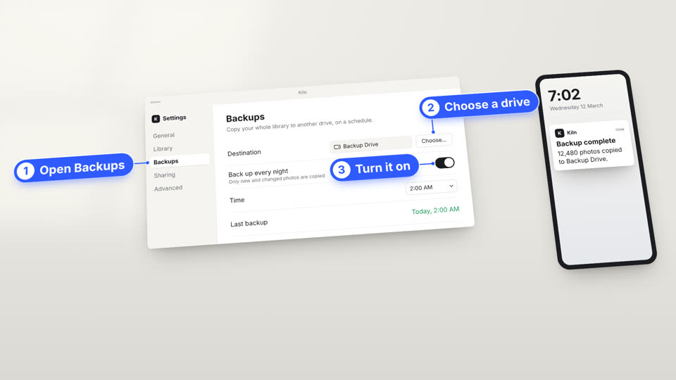
A pale desk where an app window, a terminal or a phone is the subject; the camera flies to the part of the screen the narration names, and the guide rings it in blue and pins the step.
Essence, and what it is not
- The screen is the subject, the desk the world: windows, terminals and phones lie on one matte desk under one camera, each with a long soft shadow.
- The camera is the narration's attention: it cranes down to open, flies to the next screen, pushes in on the named control, pulls back to close.
- Two hands: the ink cursor is the viewer's; blue is the guide's alone (rings, step capsules, leaders, a click's ripple).
- The app is greys and ink, so blue always means "look here".
Not a slide of screenshots (the screen is a place the camera moves through), not a dark keynote (Stage Light), not a UI collage.
Ground and material
desk.tsx: a warm pale matte (bg) lit from the upper left, faint window panes, a fine tooth, a light vignette. Its frame is a camera's (data-camera) over screens laid out in desk pixels. Screens are white slabs with one shared shadow (RESTING, window.tsx).
Colour roles
data: cobalt, the guide's: rings, capsules, leaders, ripples, a pressed key, a title's small label. Never inside the app.grad: pale blue, a ring's halo and the lift's highlight.text: ink, the app's text, primary controls and the cursor;muted,faint,border,panel2: its greys.goodonly for a stated success (a ✓ line),badonly for a failure. A figure on a card is ink; what it replaces is struck inmuted.- Content in the app is soft and desaturated.
Type and captions
Inter (sans) for app and guide: interface text 23 to 38 desk px, 32 px or more on screen once the camera has pushed in (a wide shot may show it small), titles 60 to 70, step labels 34 bold at any zoom. JetBrains Mono (mono) for terminals (27) and small capitals. Chinese: Noto Sans SC. The caption is a white rounded card with the screens' shadow, ink 36 px: one more slab on the desk.
Motion
Crisp. A move between screens is a 1.1 to 1.5 s flight (cubic-bezier(0.55, 0, 0.18, 1)) with travel tweened beside it: the camera rises mid-way and the desk smears. The cursor lands just before the camera, dips on the click, throws a ripple and sparks. A ring is drawn by its glowing head and pulses once. Things are set down from above with a small overshoot; a terminal swings in on its hinge. Text is still once the camera lands; tilt and turn only when wide.
Composition and framing
Open wide and tilted; push in (zoom 1.3 to 1.45, a strip of desk and the screen's edge still in frame) so the named control sits near the centre with its label and neighbours. The screen ends above the caption. One ring at a time; a capsule stays for its scene. The next screen stays off frame until named. Close wide, every step pinned again.
Sound
Optional: key clicks, a whoosh under a flight, a chime. No music.
Components
- close — Phone (
react/parts/phone.tsx): A plain phone slab on the desk showing the time; a notification drops in with the result and it buzzes. Fits: the result on another device: a backup done, a payment, a build shipped - compare — Before and after (
react/parts/wipe.tsx): A blue handle sweeps across a screen, wiping its old state into the new, each side named by a chip. Fits: a redesign, a setting before and after, an old plan against the new - data — Figure card (
react/parts/figure.tsx): A white card on the desk: one large figure counting to its value, what it counts, and the figure it replaces struck through. Fits: what a feature buys: minutes saved, files not copied, a price; one figure a card - ground — Desk and camera (
react/parts/desk.tsx): A pale matte desk in window light, and the camera over it that cranes, flies, pushes in and pulls back. Fits: every scene: screens inside in desk pixels; tween camX, camY, zoom, travel (x and y move the whole desk) - ground — App window (
react/parts/window.tsx): A white app window on the desk with a long soft shadow, plain grey chrome, the app inside in greys and ink. Fits: the app a tutorial is about: settings, an editor, a dashboard; one window per app all film long - mark — Cursor (
react/parts/cursor.tsx): The viewer's pointer, ink edged in white: it lands just before the camera and clicks with a ripple and sparks. Fits: a click or choice the viewer makes; the viewer's hand, never the guide's - mark — Ring (
react/parts/ring.tsx): A blue ring drawn round the named control by a glowing head, one pulse when closed, the same weight at any zoom. Fits: a button, a menu item, a field, a toggle, a line of output; one ring at a time - quote — Terminal (
react/parts/terminal.tsx): A light terminal: the command typed at a hand's rhythm, output printed line by line, a success line ticked in green. Fits: a command and its output: an install, a status check, a deploy; an example, never a measurement - steps — Step pin (
react/parts/step.tsx): A blue capsule pinned to a point by a short leader: the step's number in a white disc, then its words. Fits: the steps of a how-to, one pin per step on its control, numbered through the film - term — Keys (
react/parts/keys.tsx): White keycaps pressed down in turn as the shortcut is said, outside the camera. Fits: a shortcut: ⌘ , for settings, Ctrl C to stop, Return to run - term — Lift (
react/parts/lift.tsx): The one control rises off the screen on a white tile, tips towards the viewer, settles level, then sets back down. Fits: the setting a step changes: a toggle, a picker, a row; once a scene - title — Title card (
react/parts/title.tsx): A white card dropped on the desk: the app's icon, a small blue label and the title in bold ink. Fits: the opening of a tutorial or walkthrough
Native moves
- Fly to the control. The camera leaves one screen, rises and lands pushed in on the region the sentence names. Fits content like: a sidebar item; a field in a form; a line in a log.
- Ring and pin the step. The cursor clicks, a blue ring is drawn round the control and a numbered capsule is pinned to it. Fits content like: "choose Backups"; "click Share"; "open the Billing tab".
- Lift the setting. The one control a step changes rises off the screen, is changed while it is raised, and sets back down. Fits content like: a switch turned on; a plan picked; a date chosen.
- Type it, read it back. A terminal swings in, the command types out at a hand's rhythm, its output prints line by line, the success line ticked and ringed. Fits content like: an install; a status check; a deploy.
- Press the keys. The shortcut's caps go down one after another as it is said. Fits content like: ⌘ , for settings; Ctrl C to stop; ⌘ K to search.
- Wipe to now. A blue handle sweeps across the screen, the old state wiped into the new, then a card counts what it buys. Fits content like: a redesign; a plan before and after; minutes a feature saves.
Avoid: pitfalls
- Pushed in so far the control loses its neighbours. Fix: zoom 1.45 at most.
- The screen under the caption when pushed in. Fix: a larger
camYor a shorter screen; check the frame. - Blue inside the app: the guide stops meaning anything. Fix: the app in ink and greys.
- A screen entering before the camera leaves, half under the caption. Fix: start it once the flight is under way.
- An interface like a real product's. Fix: an invented app, plain chrome.
Freedom in each work
Each film decides its app and devices, the steps, the moves, the desk's layout, the opening and the ending. Three far-apart structures: a settings walk-through, each step a flight and a pin; a product launch, each feature wiped from old to new and its gain counted on a card; a command-line tutorial in one terminal, ending on the app it changed.